Charts, graphs, and a whole assortment of visuals are commonly used to summarize information. Although these graphics may look nice visually, the caveats behind a chart can be even more important than what’s being shown. Here are three simple questions to consider the next time you review a “data-driven” graph:
Who made it?
No matter how innocuous or objective the graph may seem, inherent biases from the creator(s) play a large role into what you see. A coffee business is probably going to create graphics extolling the virtues of coffee, while a rival tea business might try and persuade people to give up coffee for tea.
What’s the data?
The famous phrase here is “garbage in, garbage out”. Objectivity in data collection and systematic review is important for making accurate graphs, but some areas are more focused on the gray area of persuasion than maintaining objectivity. Even with objective data, interpretation and use can skew perception.
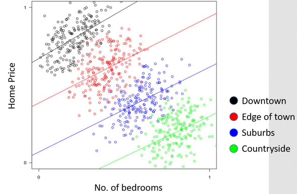
Let’s say we have two competing parties for mayor. Candidate A uses the data from a survey firm to support his proposal for to ban houses from adding additional bedrooms. Candidate B releases a flyer in response, using the same survey data to explain why she supports the direct opposite: allow for and encourage homeowners to build more bedrooms. Both candidates claim that their approach will help homeowners in the city enjoy and maintain higher home prices.
If this is the same data, why are the candidates’ graphics contradicting one another?
Welcome to Simpson’s Paradox: combining several groups of data with distinct trends can lead to a very different trend than looking at each group separately. In aggregate, a simple linear regression with all the data shows a negative trend between number of bedrooms and home price (which Candidate A used as evidence). However, this ignores that there are several major groups which can be separated out: downtown, edge of town, suburban, and countryside homes.
When you look at each group separately and compare, you see that Candidate B’s logic makes more sense, at least from a correlational perspective: houses in the same category with more bedrooms generally have higher home values than houses with fewer bedrooms.
What’s Missing from the Picture?
This is the most important question out of the three to think about, since a graphic may not contain everything you’d want to know. Footnotes, sources, business rules, and even the scale and design of an axis all can dramatically affect perception and interpretation.
One of my favorite misleading graphs is the “Florida Gun Deaths” graph that still circulates from time to time. Take a moment to review the graphic:
See what’s unusual?
Interestingly enough, this graphic has normal answers to the first two questions:
- Who made it? Reuters, which has a pretty good reputation in its reporting.
- What’s the data? The source is the Florida Department of Law Enforcement, so it’s coming straight from official reports. Further review might unearth questions with how the department classifies things, but this data is satisfactory for its intended purpose.
Despite that, the graph is at best badly designed, and at worst purposefully misleading to readers.
Notice the reversed axis? The lower the point on the chart is, the higher the number of murders committed by firearms in a given year. At first glance, most people will probably interpret the chart as showing that gun murders in Florida decreased since the Stand your Ground law. The numbers at each end of the graph, 873 vs. 721, also emphasize a “decrease”, even though 873 appears lower on the graph than the 721 point. As it turns out, the opposite interpretation is what’s actually happening; murders by firearm dramatically increased after the law was enacted (from around 500 to over 800 in the span of a couple years).
It’s important to consider the truth of the situation, and that includes the situation in which truths are presented to you. You don’t have to be paranoid that nefarious groups are always trying to mislead you with data; instead, a healthy dose of skepticism goes a long way towards staying informed.