In a recent segment of NPR’s “Wait, Wait… Don’t Tell Me!”, Nobel Prize-winning economist Claudia Goldin was asked half-jokingly if all economists marry other economists. Not exactly, she responded: “It’s not all economists married to other economists; there are very few female economists in a various age groups, and a disproportionate number of those are married to male economists.” In order to have even a majority of economists married to another economist, “there would have to be polyandry,” answered Goldin, both tongue-in-cheek and delivered in the matter-of-fact tone of a seasoned academic.
Goldin’s response is masterful in a number of ways, including calling out the big gender gap in economics (as befits her status as a preeminent American economic historian and labor economist, especially around women’s labor market outcomes). Her response also illuminates a big folly in stats thrown around in modern marketing and evidence-based arguments: the underlying data and data cuts matter a lot more than how you arrange them if you want to accurately understand what’s going on.
The Average Zebra is Gray?
Common descriptive statistics, like mean, median, and mode, help to quickly summarize. They can also be very misleading if not properly scoped. My favorite example is “the average zebra is gray”: if you took images of zebras, split pixel by pixel, and analyzed the average color, you’d get some shade of gray. The issue is that zebras aren’t a homogenous color; they are almost always some combination of black and white fur.
A glass of red wine equals an hour at the gym?
Many news outlets ran this title in response to a study from the University of Alberta (journal link). Resveratrol, a compound found in red wine, was shown to increase heart function and muscle strength. This came with a lot of caveats: the study was done on rats, not humans; the dosage was far higher than you’d get in a glass of red wine; and retraversol was added as a direct supplement in the rats’ diets (no wine for the rats). In this case, a confounding variable is missing. Red wine has a lot of other things in it than one isolated compound, including at least one other thing (alcohol) that’s rough on your liver in excess, so you can’t extrapolate away from the study to this conclusion (no matter how snappy it may be). Extrapolation and confounding variables are big problems in translating statistics to a wider audience, since they can lead to good research getting disseminated with the wrong conclusions.
Statistics makes you drink more?
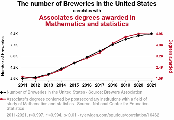
If you want to grow your brewery, should you encourage more people to get Associate’s degrees in Math & Stats? Probably not.
Spurious correlations are a lot of fun as long as you don’t take them seriously. There’s even a website that calculates tens of thousands of these correlations. When you’re running those sorts of numbers, and you only care about correlation (instead of causation), you can eventually find two trends that match each other. There’s no guarantee that this pattern will hold over time and there’s no clear explanation for why one would influence another (though some statisticians may argue otherwise).
